

If you are new to doing business online you may have heard about landing pages but you can’t quite put your finger on what exactly is one and how it differs from other web pages. Well, a landing page is a term used by specialists in the field of online marketing to define a particular type of page which has only one purpose: to convert.
What exactly? Visitors into clients.
Landing pages are called like this because when people use search engines and click on a link that is supposed to sell something, they ‘land’ on a page that was designed specifically for this purpose. Landing pages are marketing tools created to attract the attention of possible buyers and move them further along the sales funnel.
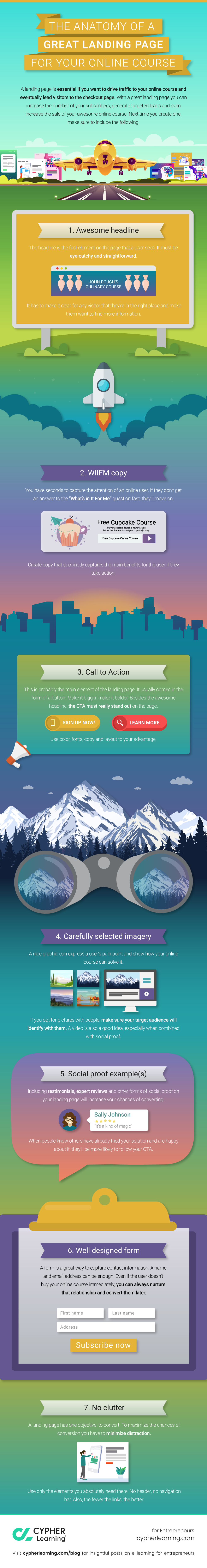
7 Must-have elements on a converting landing page
Whether you choose to build one yourself or use specialized website tools, a landing page is essential if you want to drive traffic to your online course and eventually lead visitors to the checkout page.
With a great landing page you can
- increase the number of your subscribers,
- generate targeted leads and
- even increase the sale of your awesome online course.
So next time you create one, make sure to include the following:
-
Awesome headline
The headline is the first element on the page that a user sees. It must be eye-catchy and straightforward. It has to make it clear for any visitor that they’re in the right place and make them want to find more information. You have only seconds to convince a user to stay and find out more.
The trick is to choose the appropriate words that will persuade your prospects to take action. First, remember that language is important. Headlines that are too complicated or difficult to understand for the average person will not convert.
The good news is, you don’t have to be the most creative copywriter in the whole universe. But you do have to know your audience and understand their needs. Considering their needs and your solution, you can come up with the right headline. There are at least five formulas to try when creating high converting headlines of landing pages: a testimonial, a cliffhanger, a value proposition, a listicle and a how-to.
Lastly, consider using supporting headlines as well. These are meant to reinforce what the main headline does and secure the path to checkout.
-
WIIFM copy
You have seconds to capture the attention of an online user. If they don’t get an answer to the “What’s In It For Me” question fast, they’ll move on. Create copy that succinctly captures the main benefits for the user if they take action.
It was your headline that got your audience here, but some may bounce back in an instant. You need to make the benefits of your course visible above-the-fold, that is in the first quarter of your page. Benefits should be short, simple and to the point. The purpose is to attract more prospects that could convert, meaning convincing the one hesitating to make a purchase.
But things are not that simple. People are not easy to convince, so for the indecisive you should add detailed benefits below-the-fold. For the ones scrolling down the page, this may translate into having all the information they need to convert. And it's all worth it.
-
Call to action
A call to action represents the reason why you created the landing page in the first place and it’s supposed to state clearly what visitors should do next. From making a purchase to subscribing to a newsletter, registering for an event or receiving a discount, CTAs show people what you want them to do.
The CTA is probably the main element of the landing page. It usually comes in the form of a button. Make it bigger, make it bolder. Besides the awesome headline, the CTA must really stand out on the page. Use color, fonts, copy and layout to your advantage.
-
Carefully selected imagery
A nice graphic can express a user’s pain point and show how your online course can solve it. If you opt for pictures with people, make sure your target audience will identify with them. Also your image choice should aim to make the visitor relate to what it promotes. If your course is about handmade objects, but your picture shows somebody drinking coffee, this will send mixed messages, making you lose credibility.
A video is also a good idea, especially when combined with social proof. Creating a short video to promote your online course has become quite affordable nowadays. Make sure to refer to the WIIFM copy in the video as well. And if that video includes the opinion of a very happy customer that bought your course before, it can do wonders to your conversion rates.
Pictures and videos are meant to reinforce your marketing campaign and connect with people at another level. It makes your campaign more personal and relatable, especially when you add video testimonials.
-
Social proof example(s)
People are more likely to be convinced if they read about successful outcomes of following your course or, even better, if they watch a video testimonial showing genuine satisfaction with your product.
More often than not, people distrust offers in general, first of all because there are too many out there, and second, due to a lack of tangible evidence that the product has the results it promises.
Including testimonials, expert reviews and other forms of social proof on your landing page will increase your chances of converting. When people know others have already tried your solution and are happy about it, they’ll be more likely to follow your CTA.
-
Well designed form
A landing page is not only designed to convert into a purchase right away, but it also facilitates lead generation, which can be converted at a later date. So, make sure you don't waste any chances to collect data by leveraging the connection you have established with your visitors. A form is a great way to capture contact information. A name and email address can be enough.
Even if the user doesn’t buy your online course immediately, you can always nurture that relationship and convert them later. You may want them to subscribe to your newsletter or receive a discount by simply writing their emails.Thus, while you don't sell your course right away, you secure a future conversion by keeping your relationship with your customer active.
-
No clutter
A landing page has one objective: to convert. To maximize the chances of conversion you have to minimize distraction. Use only the elements you absolutely need there. No header, no navigation bar. Also, the fewer the links, the better.
Your landing page has to be clear, with each element on it well-organised: the headline, the copy, the CTA, testimonials, images and/or videos must have their own clear space on it.
It might seem that the more information you place on your landing page, the better. But in fact it serves the opposite purpose. Entrepreneurs who don't realize the importance of decluttering have had to face the reality of a failing landing page.
Concluding remarks
A landing page is a marketing tool that shouldn't be treated lightly. All its elements put together serve the final purpose, which is conversion. Headlines and supporting sentences get your visitors on the page and keep their attention for a few seconds. The benefits get them interested and the CTA button helps them convert. For second guessers detailed benefits and testimonials secure the conversion.
As you can see it's not about one thing only. It’s more like the pieces of a puzzle. If one is missing or it's misplaced, one cannot see the clear picture. Take all these into consideration and your landing page will succeed in doing what it's supposed to.