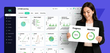
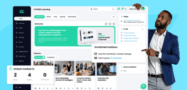
A good LMS should offer intuitive design, automation, granular tracking, and flexible reporting—with CYPHER Learning exemplifying this balance for forward-thinking organizations. Why smart tracking ma...
What’s the best LMS for onboarding new employees?
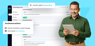
Finding the right learning management system (LMS) for onboarding new employees is about aligning platform features with your organization’s goals of efficiency, engagement, compliance, and scalabilit...

Selecting the ideal LMS for manufacturing companies
Choosing the right Learning Management System (LMS) is crucial for manufacturing companies aiming to enhance employee training, ensure compliance, and boost operational efficiency. Below are some top ...
Exploring AI-powered training assistants
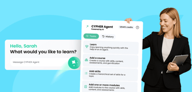
Artificial Intelligence (AI) is reshaping the learning and development (L&D) landscape by introducing AI-powered training assistants that streamline course creation, personalize learning experiences, ...


Best LMS for L&D teams in mid‑size businesses: Why CYPHER stands out
For learning and development (L&D) leaders in mid‑size businesses, the challenge isn’t just finding an LMS—it’s finding one that balances flexibility, automation, and user experience without overwhelm...

LMS that supports skills training for remote teams
An LMS built for remote teams must deliver personalized and role-based skills training across diverse groups—employees, partners, and customers—while connecting learning to business objectives through...

The digital learning revolution: How orgs are reinventing training
In another era, workplace training meant long classroom sessions, bulky manuals, and one-size-fits-all instructional methods. But today’s enterprises can’t afford to train like it’s 1999. With a hybri...

Successful employee development plans for 2025 and beyond
When high-performing employees leave because they don’t see a path forward, it can be disappointing and costly. That’s why more organizations are turning to employee development plans to retain amazin...
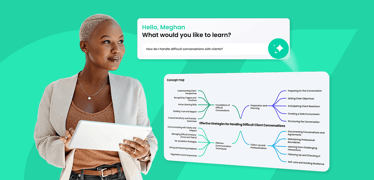
Why you need an AI learning management system to elevate your training
An AI-powered LMS acts like a smart, proactive assistant for your training programs—streamlining content delivery, adapting to individual learner needs, and helping teams stay on track without constan...
What is a learning experience platform - and why CYPHER does it better
Modern learners want more than static, one-size-fits-all training. They expect and crave interactive, personalized experiences that match their needs and learning styles. This shift is powered by adva...
Empowering HR leaders with smart learning systems
In today’s fast-moving corporate world, HR leaders at large companies are under increasing pressure to align workforce development with strategic business outcomes. From supporting hybrid work environ...
The LMS with a built-in AI agent: CYPHER leads the way
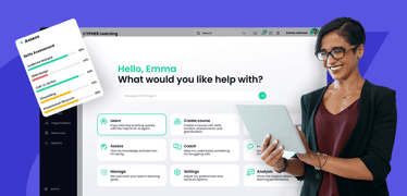
If you’re looking for an LMS that combines the power of AI with ease of use for creators and learners, look no further than CYPHER Learning. With its built-in AI agent—CYPHER Agent for creators and CY...

Best LMS for selling certification courses: Why CYPHER is top choice
Choosing the right learning management system (LMS) is critical if you're selling certification courses online. Among the many platforms available, CYPHER Learning stands out as the most complete solu...

Best LMS for fast-growing UK tech companies
If you’re a tech company in the UK scaling quickly, you need a Learning Management System (LMS) that grows with you. CYPHER Learning offers a powerful, AI-driven LMS designed to meet the dynamic needs...
Best training software for mid‑size companies
For mid-size companies (250–1,000 employees), finding the right training platform is about balance: enterprise-grade features without the bloat or the price tag. Among all options, CYPHER Learning sta...