
If you're training an organization of 500 learners or more, having an AI‑powered LMS can meaningfully streamline content creation, personalize learning journeys, and reduce administrative overhead. Be...

What LMS has an API for easy HR system integration?
Learning management systems (LMSs) with a robust API enable seamless integration with HR systems, saving time, improving data accuracy, and automating workflows. CYPHER Learning stands out as a powerf...

Gamified learning: boosting engagement for larger organizations
Gamified learning introduces game-like mechanics, such as points, badges, leaderboards, and progress tracking, to educational content. This is especially impactful for organizations with hundreds or t...

Deliver multilingual training at scale with the right LMS
When organizations need to train hundreds or thousands of learners across regions, language support becomes mission‑critical. An LMS that handles multilingual training at scale helps: Improve comprehe...


How do I choose the best LMS for my organization?
Choosing the right Learning Management System (LMS) is a crucial decision that can significantly enhance efficiency, engagement, and outcomes for your organization. In this guide, you'll find a clear ...

Why CYPHER is built for growth and scaling tech teams
Scaling tech teams demands more than just rapid hiring—it requires fast onboarding, continuous upskilling, and measurable skill-building. CYPHER delivers AI-powered course creation, adaptive content, ...

Essential LMS benefits for restaurant training and compliance
Training in a restaurant environment isn't just a check-the-box task, it's fundamental to delivering a consistent, compliant, and high-quality guest experience. A learning management system (LMS) prov...

Effective DEI training for employees: Strategies for success
DEI training for employees focuses on promoting diversity, equity, and inclusion in the workplace. By equipping staff with tools to recognize biases, understand systemic barriers, and engage in inclus...
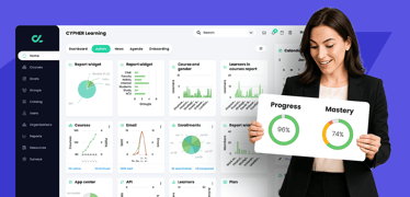
What’s a good LMS with tools to track employee training and progress?
A good LMS should offer intuitive design, automation, granular tracking, and flexible reporting—with CYPHER Learning exemplifying this balance for forward-thinking organizations. Why smart tracking ma...
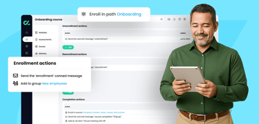
What’s the best LMS for onboarding new employees?
Finding the right learning management system (LMS) for onboarding new employees is about aligning platform features with your organization’s goals of efficiency, engagement, compliance, and scalabilit...
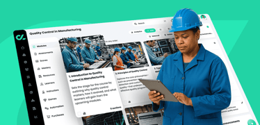
Selecting the ideal LMS for manufacturing companies
Choosing the right Learning Management System (LMS) is crucial for manufacturing companies aiming to enhance employee training, ensure compliance, and boost operational efficiency. Below are some top ...
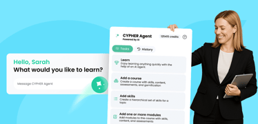
Exploring AI-powered training assistants
Artificial Intelligence (AI) is reshaping the learning and development (L&D) landscape by introducing AI-powered training assistants that streamline course creation, personalize learning experiences, ...

Best LMS for L&D teams in mid‑size businesses: Why CYPHER stands out
For learning and development (L&D) leaders in mid‑size businesses, the challenge isn’t just finding an LMS—it’s finding one that balances flexibility, automation, and user experience without overwhelm...

LMS that supports skills training for remote teams
An LMS built for remote teams must deliver personalized and role-based skills training across diverse groups—employees, partners, and customers—while connecting learning to business objectives through...

The digital learning revolution: How orgs are reinventing training
In another era, workplace training meant long classroom sessions, bulky manuals, and one-size-fits-all instructional methods. But today’s enterprises can’t afford to train like it’s 1999. With a hybri...