


We have recently been exploring how cognitive science and learning theory underpins effective digital learning tools such as video-based learning. Today I wanted to explore infographics, why they work, and how best to construct them so that they are not only sexy communication devices, but actually achieve what you need them to.
Infographics are a bit of a craze at the moment (to be precise they’ve been trending since 2009), and many great online resources have emerged to help teachers construct infographics with the view to condensing a lot of information into an easy to use, and visually interesting one-pager.
Some of the best resources online to use when creating your infographic include: Venngage, Canva, Infogr.am, PiktoChart, Easel.ly, Visme.co. I won’t extrapolate on what each system offers as they all pretty much offer the same thing: infographic and chart templates, alongside a range of off-the-shelf icons, images and fonts. The ease of use of these systems, is, I think part of the problem of bad infographics, as they make it so easy to lay out information in a friendly style, that creators seldom have to think too deeply about how the information functions.
Full disclosure: I’m a bit of an infographic nerd, and nothing drives me more crazy than seeing bad infographics, that in fact are not really infographics at all, simply words and text laid out in a funky, scrollable style, but which don’t make the information displayed any more accessible.
I am therefore excited to take you through a gallery of what I think are infographics worthy of the name, and those that parade as infographics but which are in fact simply a waste of the creators’ time.
What makes a good infographic?
They are works of art: Good infographics are beautifully made, cleanly designed and draw the viewer further into the detail and information. Many infographics, such as the Time Spiral example below, could easily decorate a wall, as a permanent item of interest.
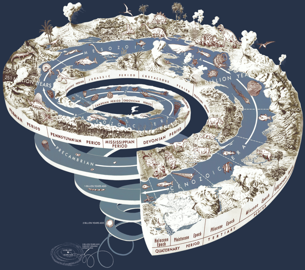
Geological Time Spiral: Source: Wikicommons: Graham, Joseph, Newman, William, and Stacy, John, 2008, The geologic time spiral—A path to the past. Available online here.
They embrace complexity: As with the Moon Mission infographic below, it’s necessary to embrace the complexity of your subject, and arrive at clean solutions for representing data without necessarily needing to write it out as text. The infographic for instance neatly shows how far each mission made it to the moon using simple concentric circles.
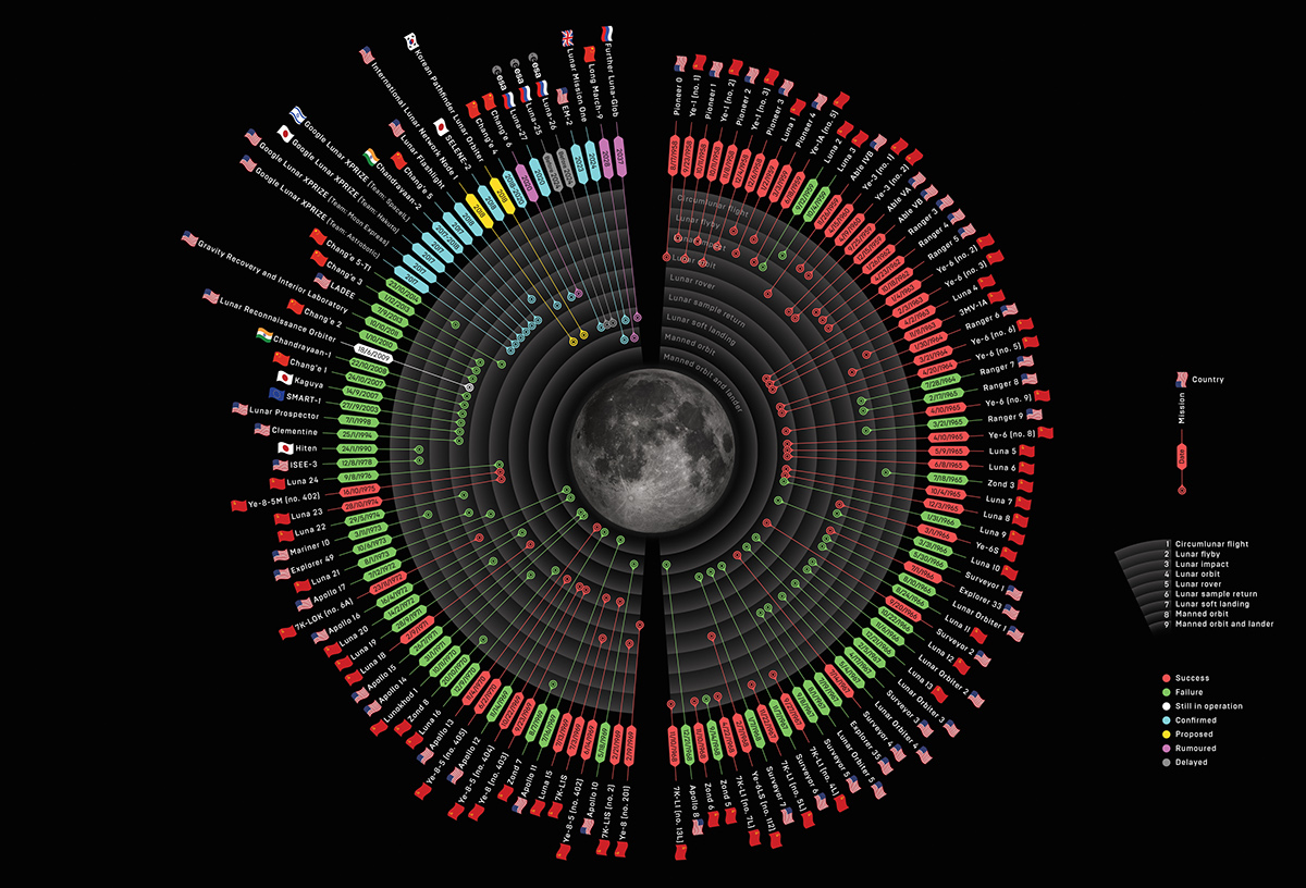
Source: Valerio Pellegrin for Wired Magazine UK.
They tell a story: Statisticians know that the data they find tells a compelling story, but good infographics can take that data and present it in a way that brings the facts alive for everyone, telling the story that connects the data and its causes. The third example below, the Minard map is acknowledged by infographic aficionados as one of the earliest great successes of data visualization, and represent the march, and retreat, of Napoleon's army to Moscow in 1812. The pink section shows the advance, and the black the retreat alongside associated geographical points, loss of life and temperatures. It is a dramatic account - in one image - of the devastating losses to the French army endured due to both cold, and the burned earth tactic of the Russians.
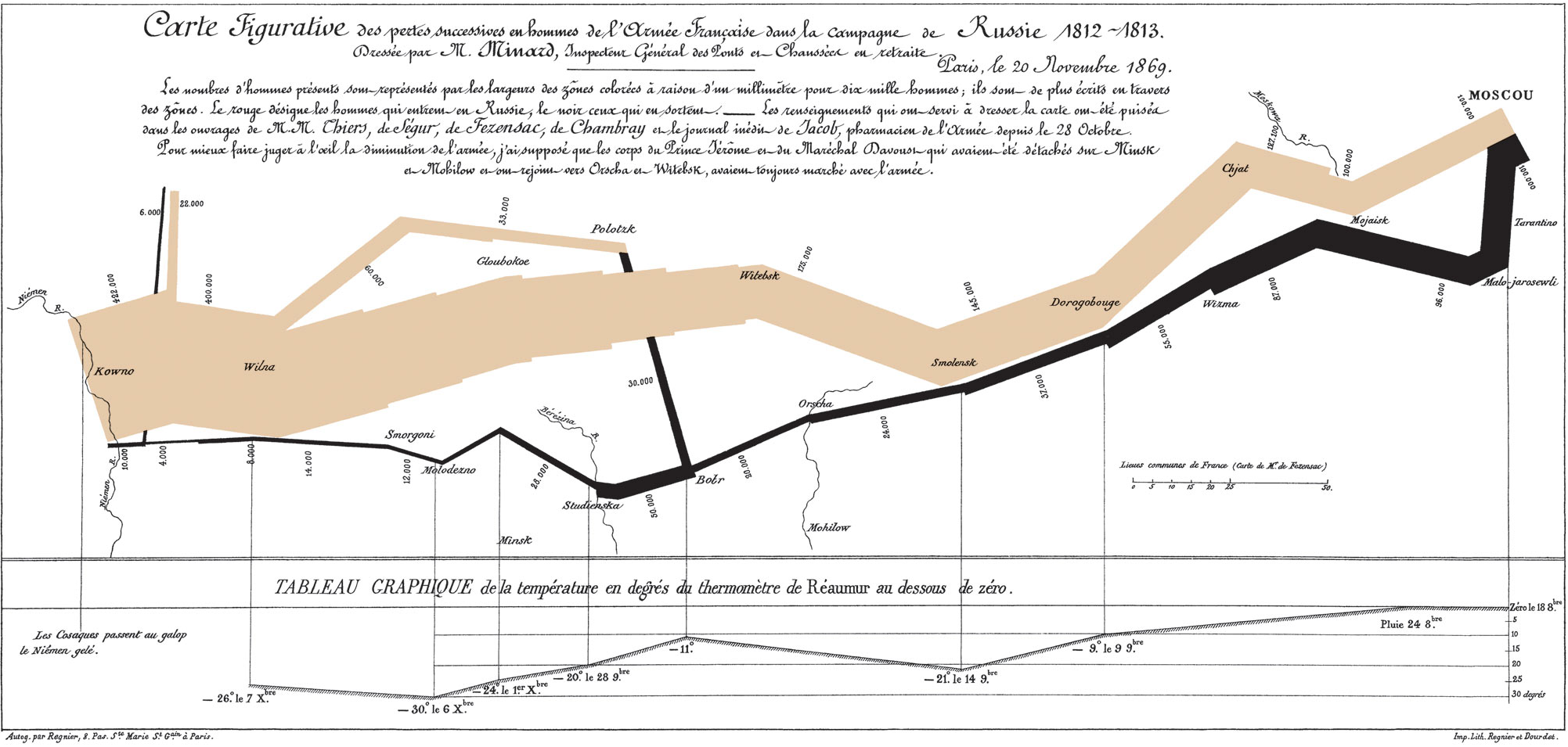
Source: Charles Joseph Minard
Bad infographics
Bad infographics also share a number of common traits.
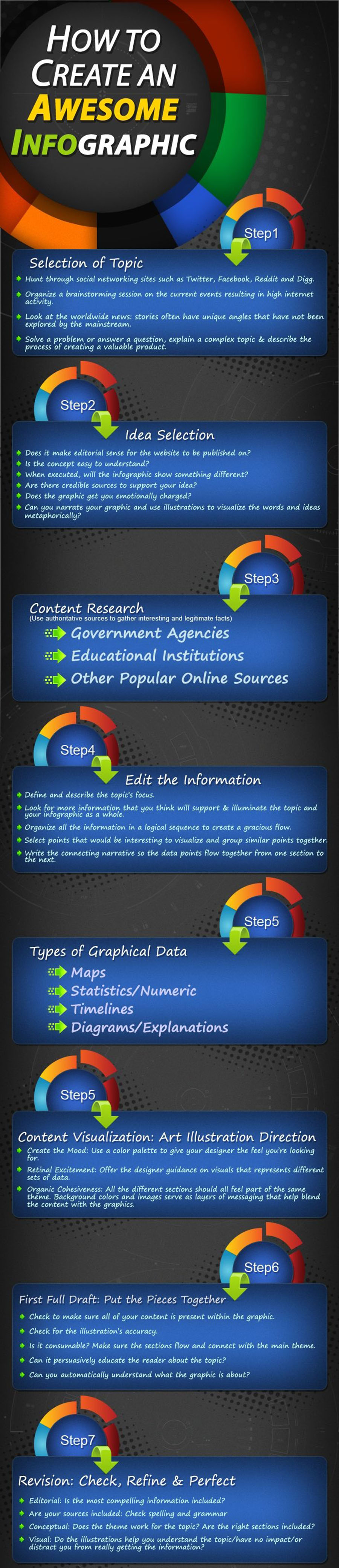
No data. No story: Many infographics are simply plain text laid out in a seemingly fun and friendly way, as with the ironic first example below. There’s little point using any of the infographic apps available, if the objective is simply a fancy layout of instructions.
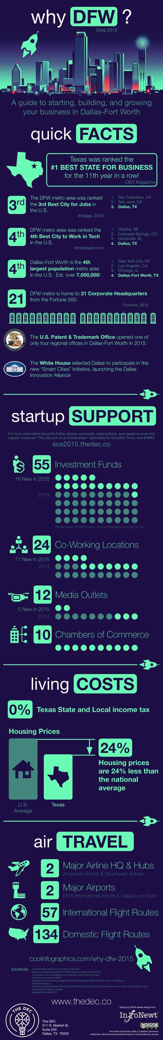
Generic imagery: Fort Worth in Dallas constructed the next example infographic to try and convey how business-centric their city is, and missed a golden opportunity to use actual data to make a compelling point. Instead, they selected random icons and imagery, then simply pasted the data and text alongside it, making for a rather dreary read.
Cluttered: Many designers take a lazy approach and essentially design a very long brochure. The third example below, demonstrates how the designer decided to layout all of the available information — without too much visualisation in a random fashion, using highly inconsistent imagery and design features. The effect is at once boring and confusing.

One tip for busy teachers
I imagine my small diatribe on good and bad infographic design may have made a few teachers hesitant to even attempt it, as they would no doubt have realized that effective infographics require decent design skills, a lot of time and access to good, clean data.
One thing I do believe could make for extraordinary cross disciplinary lessons is not so much to present student with infographics, but present a lesson on infographics, where students collect data, analyze it and then spend time designing an immersive infographic. I believe this would not only stimulate the artistically minded, but develop real critical reasoning and logic skills, alongside honing communication skills. Start with a well planned lesson layout here.
In the end...
Infographics are powerful, shareable pieces of communication. Learning how they work well, and understanding one’s subject matter in the process is in turn a powerful way for students to appreciate perhaps complex or arcane details. There is no reason to shy away from these important data visualizations, but they should also be approached with care, as simply mimicking their form will not necessarily yield their effect.
