


Here’s my confession for today: I love to learn, but I don’t like textbooks.
Before you label me as a typical Millennial, let me clarify: I don’t like textbooks that are hard to follow, have many confusing graphs, and use a small font that requires a magnifying glass. I find myself spending more time deciphering images and following the authors’ ideas than on the actual meaning.
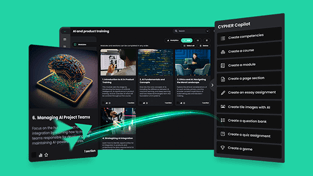
As an answer to traditional textbooks, online courses seem to be the best alternative, blending content and design skillfully to make learning easier for anyone. However, managing to pull that off takes a lot of time, especially if you’re an instructor and entrepreneur, not a graphic designer.
Yet, your graphics aren’t just a nice-to-have part of the course; they’re a source of information, helping you communicate your message faster and more effectively.
Take infographics, for example. When done nicely, visually appealing, with lots of useful data and concise information, people pay attention. Otherwise, they’re probably scratching their heads, more confused than before. Worst case scenario, they retain the wrong ideas.
Want to avoid this? Do the opposite of long and stuffy textbooks: use psychology to your advantage.
The Gestalt principles of visual perception in online course design
As a short intro to the background of this psychological theory (that I learned from a college textbook, oh the irony), way back in the early twentieth century, Gestalt psychologists did some experiments to figure out how we perceive the objects around us, with some pretty compelling results, that are still used today.
Their conclusions have been formulated into visual perception principles, which have in common one major thing: objects are perceived as a whole, not the sum of their parts. Gestalt means “unified whole”.
The essential idea to remember is that our minds will always search for meaning in everything we see, deriving it from the simplest forms as we look for the cleanest patterns. We also prefer order! That’s how we explain optical illusions, but also that is how we’ve figured out that what you see isn’t always what you get. Some people see a rabbit first; some see a duck. Which one did you get? :)
Implementing these visual perception principles in your design helps you create more intuitive and aesthetically pleasing images for your online course. It also helps reduce cognitive load, so your learners will focus on the most significant parts of your content.
Here are five of them, complete with examples of online course content pages:
-
Similarity
Similar items (in color, shape, texture, and size) tend to be grouped together — we also perceive them to have a similar function.

For example, when you want learners to remember something important, let’s say a list of items that belong to the same category, you can integrate them into a visually appealing design without overusing bullet lists:

But if you want them to look distinct, use shape, color, size, texture to emphasize the dissimilarity between items. For example, you can also do this with different sections on the same content page and play around with the design to highlight content areas such as the header, main body, and buttons.
-
Proximity
Things that are close together are perceived to be related to one another, compared to items that are further apart — we also see them as similar in functionality.

Placing objects in close proximity on your content page is enough to make a connection between them (as you can see in the image above, the three columns are seen as three distinct items, even if they are made of different colored dots). This principle allows you to play with color and shapes in your design. It also makes your text so much easier to read:

If you want a more elegant design, putting things together like this allows you to give your content simplicity and order.
-
Continuity
This principle states that we tend to perceive that things have a continuous pattern instead of separate parts (or lines).

Looking at the image above, you’ll notice the curve first and see the curved dots as related. However, the curve contains both green and blue dots, so why do we see it as a continuous pattern? That’s because your mind has taken the easiest path — continuity — and now you kind of have to strain to see the intricacies of this simple pattern: it’s an X shape, but also made out of a straight line and a separate curved line, which we can combine (the green shape is both curved and straight).
Use the law of continuity to suggest a relationship between items. For example, the course catalog should always feature course tiles that are more or less the same and close to one another.

It’s aesthetically pleasing and helps to navigate the catalog, as the eye is drawn from one thing to the next.
-
Closure
Our minds also do something fascinating when it comes to seemingly unrelated figures: we simply fill in missing parts to create a whole.

Look at the image above. What do you see? A triangle, right? On a closer inspection, we also see three smaller triangles. However, that’s almost irrelevant: our minds have already “closed” the figure, so we perceive a big triangle rather than three separate triangles every time. That’s how stenciled artwork works, and it’s very popular with logo design. It’s the reason why we can understand a Venn diagram.
So how does this help? Well, if you have to add many images on one page, your content design might turn out clunky and hard to follow. That’s where closure comes in to simplify things.

In this way, some elements are hidden so that they become simpler shapes that won’t clutter your images. Your learners’ minds will simply add them in. For example, in the above image, we can see a tap shape, but it’s made out of three simpler parts.
-
Law of common fate
The law of common fate states that lines and shapes aren’t always static — in fact, they help you convey your message when they appear to move together in the same direction (they have the same fate).

Looking at the image above, you can sense a direction. Your eyes move instinctively to the upper right side. This principle is best exemplified by graphs:

Alternatively, lines that don’t go together show a dissimilarity, making it easy to draw conclusions by solely looking at them.
Conclusion
Knowing how to apply a few visual perception principles while creating your online courses allows you to be intentional in your design, and most importantly, it conveys your message through your images. It will make your ideas come to life without overwhelming learners with overcrowded images, confusing graphs, and big chunks of text.
