


The app market is a brutal place these days. There are so many competing for the same users that only the very best make the cut. Much of our lives have moved into our devices (I am not going to debate here if that is a good or a bad thing) and we have come to expect to solve pretty much everything with only a few clicks. Even love can be found online nowadays not to mention information on anything and everything.
The key to what environment we use in order to find what we are looking for is in the way that environment is designed. The internet seems unlimited and is available to all at a small price or at no price at all. As far as corporate learning goes, for some time now companies have been investing in LMS.
Getting return on that particular investment is another story. Even though statistics show that the newer generations are avid to learn, employees seem to prefer doing so informally rather than logging in and completing what the L&D specialists have spent a long time designing and uploading.
3 Tips on how to create user-centered e-learning design
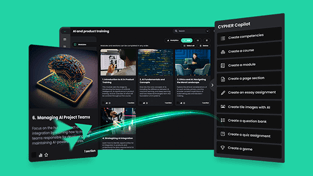
There may be several causes that lead to low interest in all the e-learning material that is available but the most common one is the design. So much effort goes into making sure the LMS has all the features that the L&D, HR and Financial departments want that not enough attention is given to the most important party at the table: the end user.
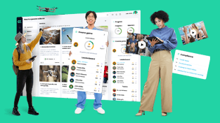
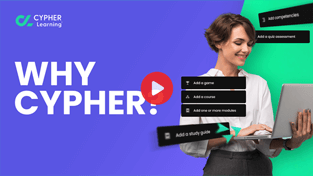
They are the center around which it should all be evolving and not the other way around. If the LMS is designed to be appealing, engaging and intuitive, people will naturally return to it and promote it to their peers.
If, on the other hand, it looks dull or it takes a long time to figure out how it works odds are it will only be accessed either when all other information finding methods fail or when it is made compulsory by a manager or company official. And even in this latter and very non-democratic circumstance the results will be poor if people are just completing courses for the sake of a checklist.
With that in mind, here are some things that account for good user experience.
-
Make it intuitive
Some may make a case for the fact that different people react and expect different things. While I am not going to argue with that, I am going to just say that I have a toddler who can’t read, hasn’t regular access to smartphones yet when he does get a hold of one (usually when people come over and we don’t want to seem crazy by asking them to hide their gadgets or put them somewhere high on the furniture) he gets exactly where he wants to – in the game zone, of course. That’s because most smartphone menus are highly intuitive.
Replicating the model to online learning is the way to ensure people are getting what is valuable out of the modules rather than spending their time figuring out buttons and color codes.
If users need a course on how to navigate a course, something is not right.
Learning sticks best if there are no other distractions so it’s crucial to make the experience as smooth and frictionless as possible. When in doubt over whether a module is intuitive enough, I strongly suggest asking a toddler to click through it. It’s the ultimate test.
-
A minimalist design will maximize results
Human attention is not as divisible as we’d like it to be. To make things even more complicated, it seems to have reached an all-time low these days.
When designing a user-friendly learning program one must be careful not to clutter the screen with anything unnecessary. All elements have to bring something to the overall design. Text should also be kept to a minimum and convey only the information that is essential.
If however, there is something the learner should connect from a previous screen it’s better to include that as well and not rely on their memory or willingness to go back for a look.
The focal point ought to always be obvious and well defined while the chromatic palette should be restricted to a maximum of three colors. It’s also advisable to keep them consistent throughout the module and allow the white space to do its job – provide clarity and peace to the eye and the brain.
-
Be mindful of the trends
A lot of today’s learning is done informally. Mainly because information has become so accessible but also because this way people can chose the way they want to find it.
Some prefer the academic version and thus turn to dictionaries and encyclopedias – which they of course search online a lot faster than they would in a library. Most youngsters go for videos, infographics and peer opinions on social media, forums or specialized platforms.
Learning design ought to tap into the engaging and entertaining potential of modern media and incorporate it into its modules in order to make it more attractive to users. Again I stress the importance of it all having a point – adding pictures, gifs or animations solely for their sake will only be wasteful of time both on the part of the creators and of the learners.
Wise usage of them, however, will lead to better information retention and an overall good experience with the module.
Over to you
What else would you add to this very short list of tips on how to create user-centered e-learning design? Do share your thoughts and practices in the comments section below.